
National Data, All States and District of Columbia
February 22, 2022
Data thru February 21, 2022, unless otherwise noted on chart.
U.S.-LEVEL COVID TESTING, CASES, DEATHS and VACCINATIONS: CUMULATIVE TRENDS
…


Figures 1 thru 7 are shown in sequence, top-to-bottom.
Figure 1 shows the cumulative tallies of the number of COVID tests performed and the number of positive cases against a linear y-scale. Over time, roughly, 6.8% of tests resulted in a positive diagnosis.
Figure 2 shows the same data plotted against a logarithmic scale. The advantage to using a logarithmic scale are two-fold: (i) It allows for a clearer picture of the trend for the COVID cases data line. The number of COVID cases is dwarfed in Figure 1 when compared to the number of COVID tests given; and (ii) the second advantage of using a logarithmic scale comes when comparing the two lines:
Periods of expanding space between the two lines indicate that COVID cases are growing less quickly than the number of tests given.
Periods of roughly parallel lines indicate the number of new tests and new cases are growing (or leveling off) at the same rate.
Periods where the two lines are converging indicate that new cases are increasing more rapidly than new tests are given.
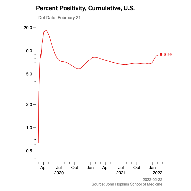
Figure 3 has been modified on June 8, 2021 to show the cumulative positive percentage rate of the tests given. That is, for each new day, the positive percentage value plotted represents:
positive percentage = [(total number of cases) / (the total number of tests)] X 100
The current cumulative positive percentage number is roughly 7% and is somewhat high compared to current daily positivity results. This is because the cumulative calculation includes long periods of high positive test results in the Spring of 2020 and, to a lesser degree, earlier this winter. Previous to June 8, the chart plotted positivity, a slightly different term and value.
Figure 4 displays the cumulative counts of cases and the cumulative count of deaths due to COVID. The total number of cases in Figure 4 may slightly differ form those in Figures 1 and 2 due to differences in sources and timing. Case counts in Figure 4 are from the New York Times which generally has more up-to-date information. Cases in Figures 1 and 2 come from John Hopkins University.
Figure 5 shows the same data as Figure 4 but uses a logarithmic scale for the y-axis (vertical).
Figure 6 shows that indeed, national death rates due to COVID did decline from about 6% of COVID cases to less than 2 percent of cases until January 2021. Since January, death rates have stabilized at roughly 1.8% of COVID cases. This death rate is calculated using cumulative data for both cases and deaths.
Figure 7 shows the cumulative number of vaccine doses administered in all 50 states and the District of Columbia. By administered, we mean “shots in the arm.” This may be first or second shots, as needed. This data may not include shots given at various non-state jurisdictions such as military bases, U.S. territories or other similar areas and jurisdictions.
DATA SOURCES:
[1] The COVID test and case data is provided by John Hopkins University (JHU) School of Medicine and used in accordance with a Creative Commons CC BY 4.0 License.
Prior to JHU, the COVID data was provided by the COVID Tracking Project (CTP) at The Atlantic and used in accordance with a Creative Commons CC BY 4.0 License. The CTP ceased updating data on March 7, 2021. Further updates were continued by JHU.
..
[2] The COVID data for deaths on this page is provided by The New York Times, based on reports from state and local health agencies. It is used in accordance with The New York Times and with the Creative Commons Attribution-NonCommercial 4.0 International license.
Links to the New York Times data can be found here. [https://www.nytimes.com/interactive/2020/us/coronavirus-us-cases.html]
..
[3] Vaccination data is provided by the United States Centers for Disease and Control (CDC). For further information, please see: https://www.cdc.gov/coronavirus/2019-nCoV/index.html