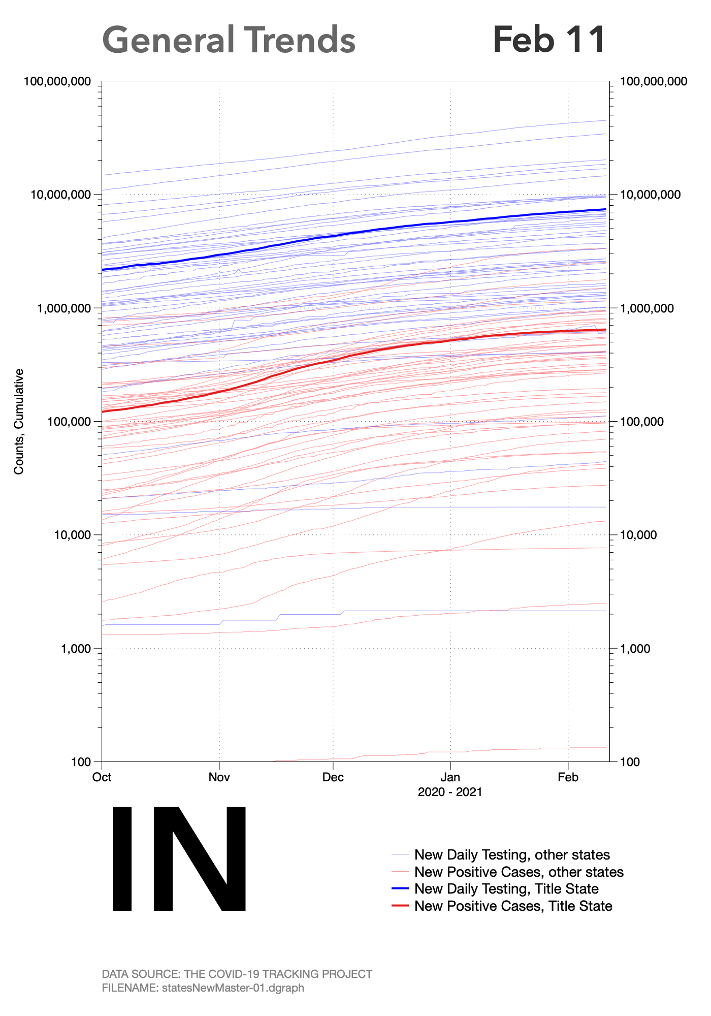
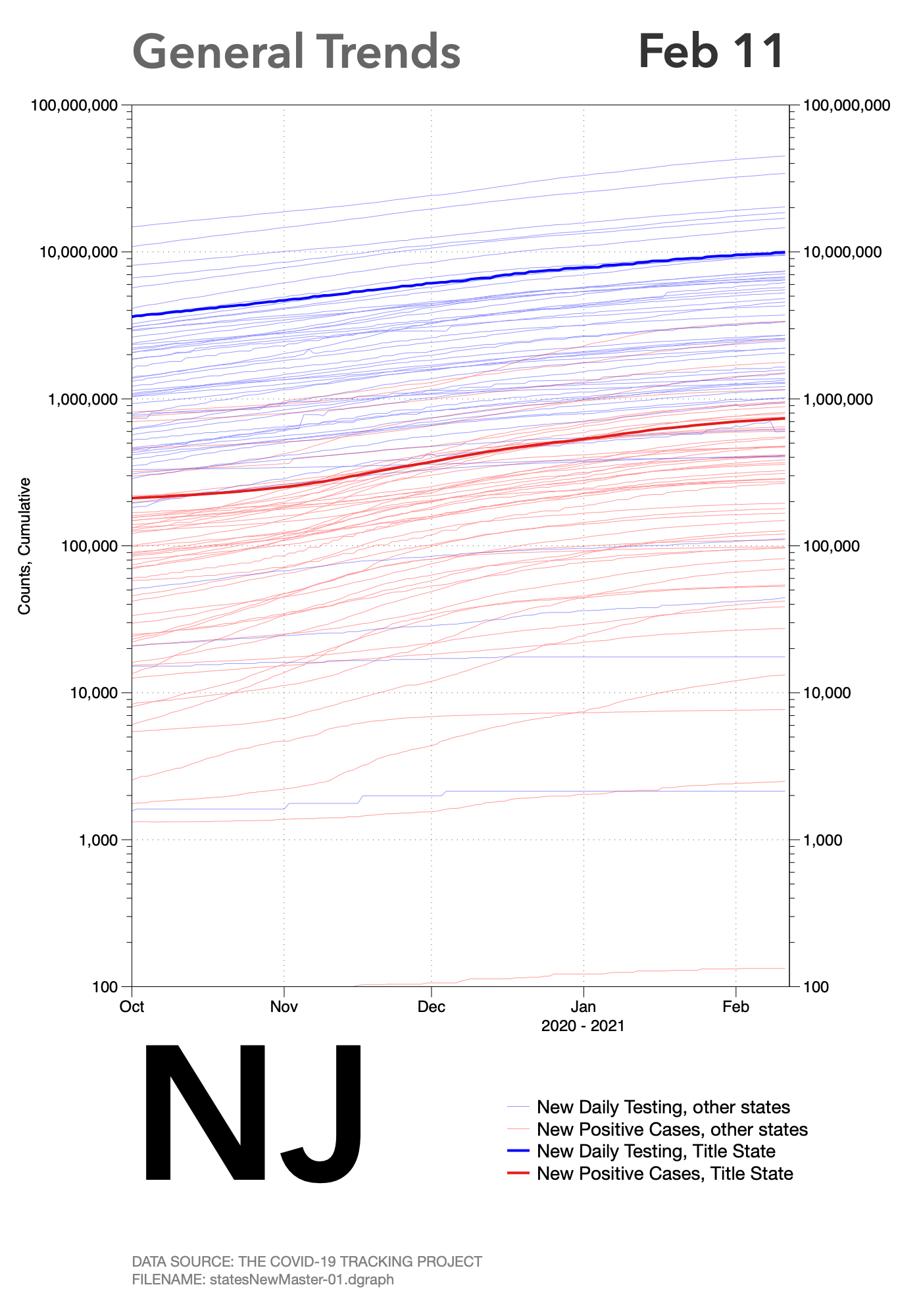
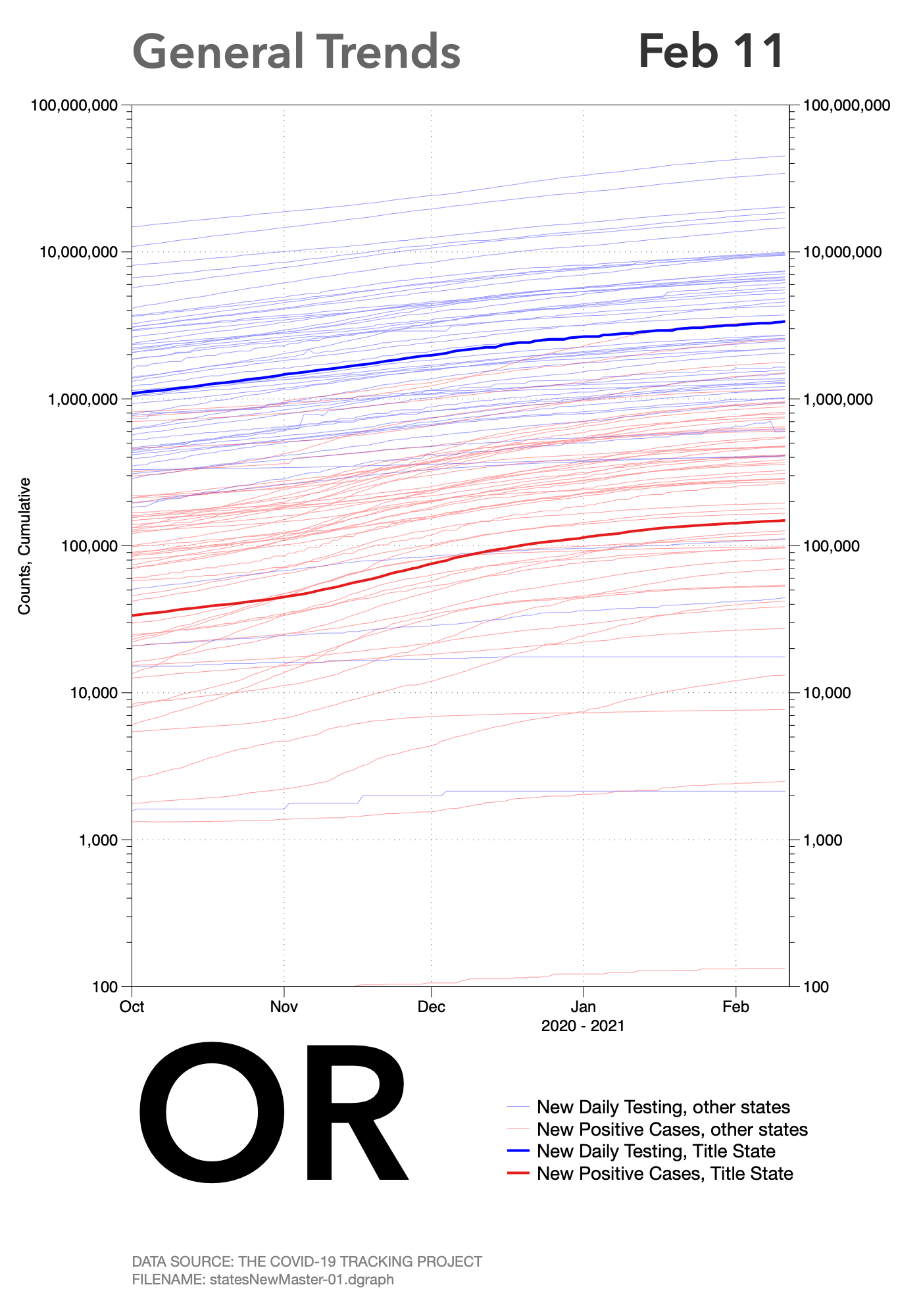
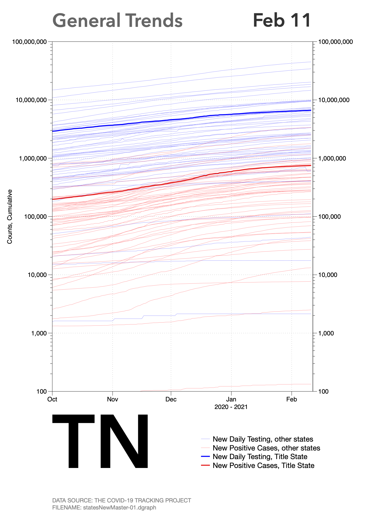
State Trends: 1b. COVID, Testing vs. Positive Returns (Slope Charts)
Data last updated: February 11, 2021
Notice: This will be the last update of state-level data. For further information, please click here.
The following charts are called slope charts. These differ from the similar looking charts under the States 1.a link. A slope chart contains only two x-axis points, or dates in our application. All data points between the start and end date are ignored. compare the rates of change in state-level testing for the coronavirus to the rates of change for positive cases.
Similar to the last series of state charts. in general, if the lines are converging, the rates of positive cases is increasing when compared to the general rate of testing. When the lines are roughly parallel, the rates of new cases are similar to the change in rates of testing. Finally, if the lines are diverging over time, the rate of new positive cases is decreasing when compared to the level of testing over time. This last scenario, of course, is the preferred outcome. The degree of convergence or divergence indicates the relative magnitude of the change.
Click on any individual chart to expand it.