
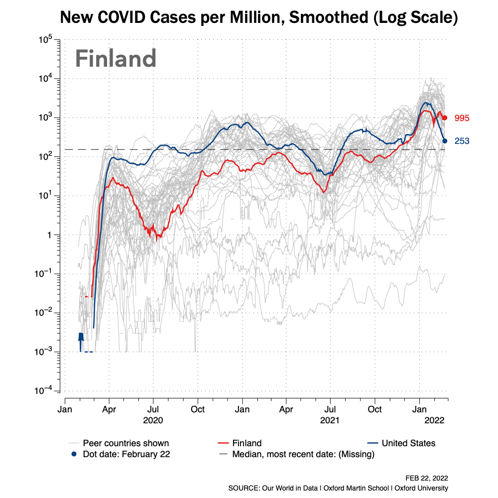
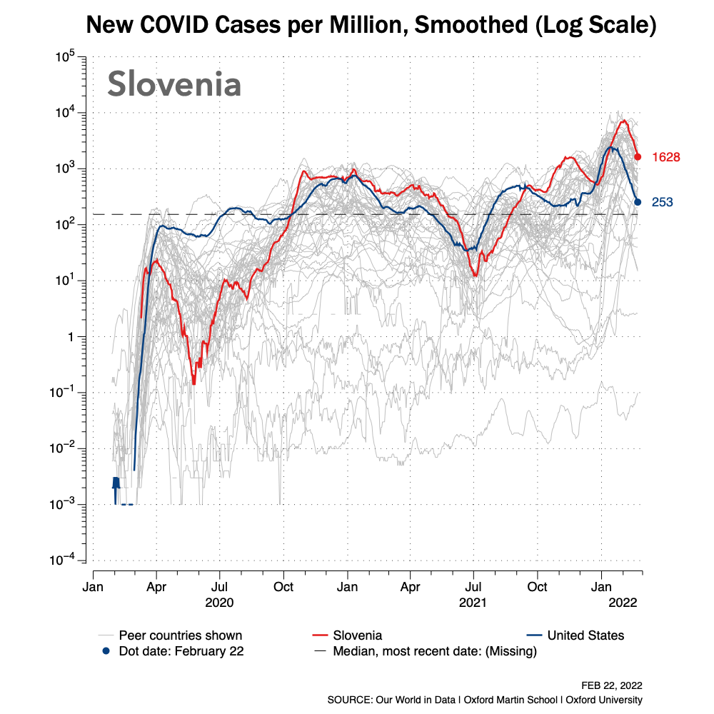
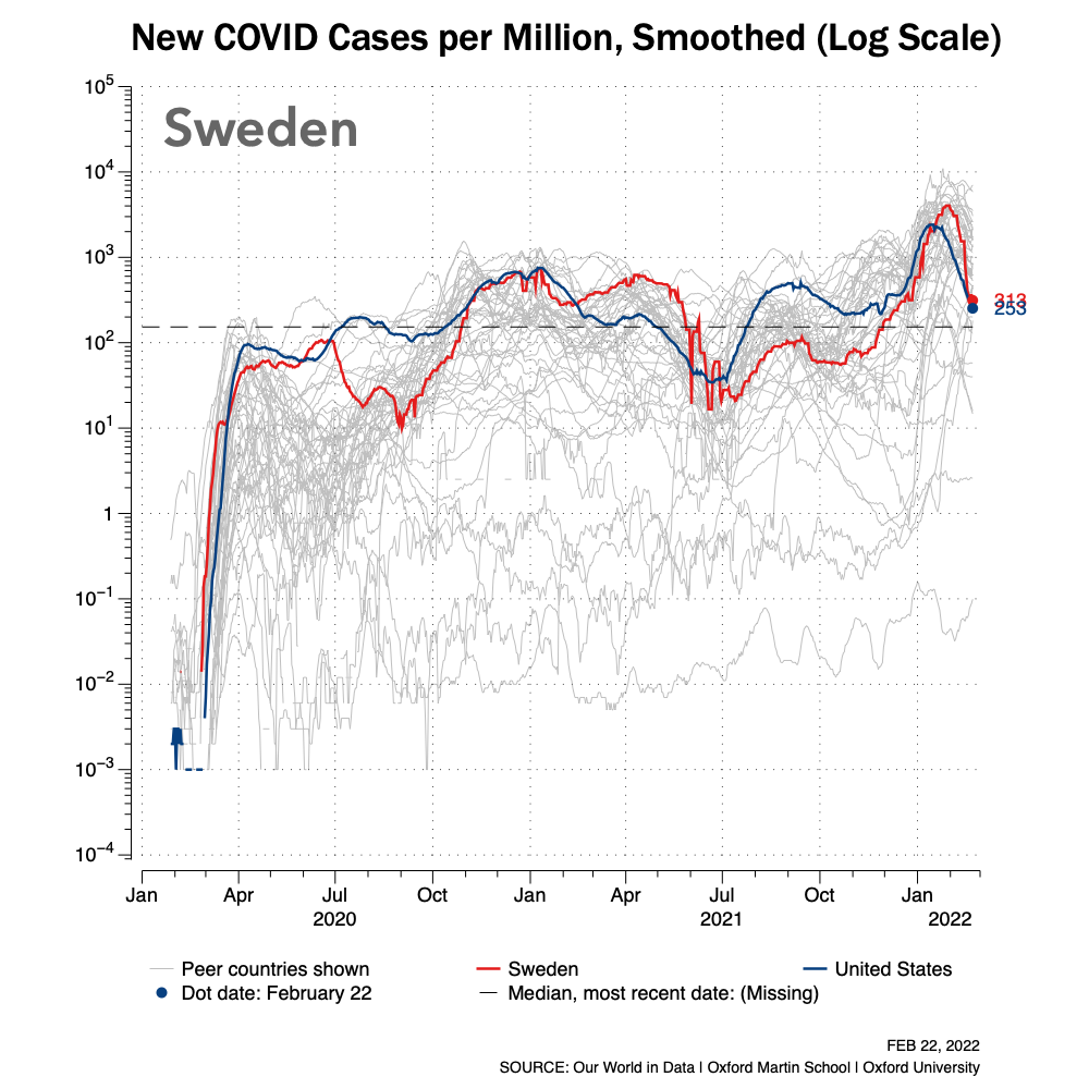
New Cases per 1M, By Country (Logarithmic Scale)
February 23, 2022
Data thru February 22, 2022, unless otherwise noted on chart.
A limited number of trend charts for new cases by country are shown below. Each chart also includes a plot of a red line for a single country and a reference blue line for similar data for the U.S. This is an initial publishing of these charts. There are too many countries to publish all charts. The plotted gray lines represent all countries for which data exists, which is most.
This second set of global time-series charts shows the same data as the first series: the number of new cases per one million people for select countries. The difference is these charts use a logarithmic scale for the y-axis. When comparing two or more lines on a time-series chart, using a logarithmic scale can clarify differences and patterns when difference in values is very large between data series.


DATA SOURCES
Data for these visualizations and charts was downloaded and used from Our World in Data (OWID) and is used under a Creative Common CC-BY license granted by OWID.