
Exploratory Data Analysis (EDA) – States: Cases and Deaths per Capita
February 5, 2022
Data thru February 5, 2022, unless otherwise noted on chart.
Return to the Covid Index page.
The charts and data on this page are arranged as follows:
Total Counts of Cases and Deaths by State (dot plots)
Counts of Cases and Deaths per capita by State (dot plots)
Distribution of Cases and Deaths per capita by State (box plots)
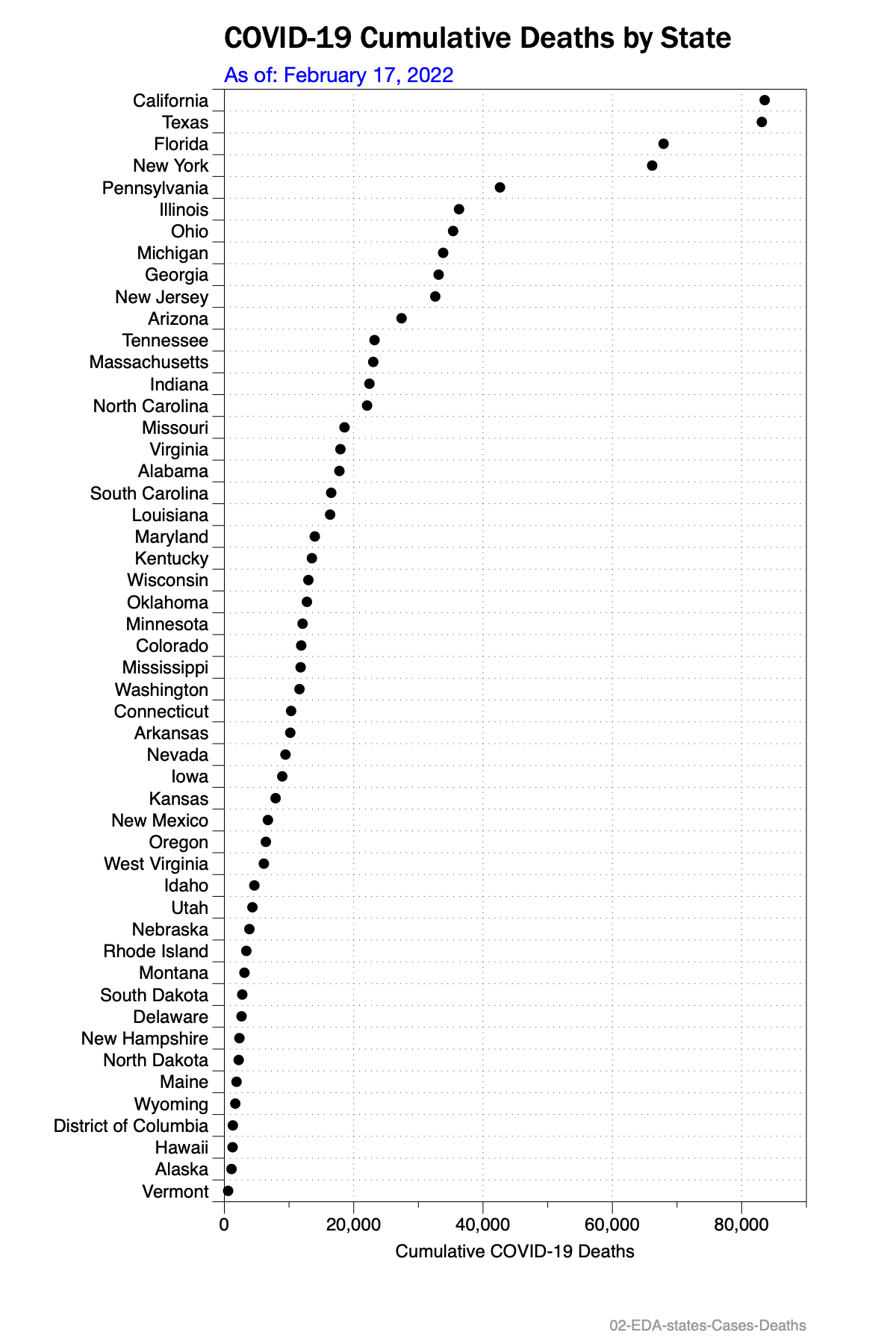
Total Counts of Cases and Deaths by State
Figures 1 and 2 are dot plots which show strict counts by state of the following data:
Total count of cases on the most recent date; and
Total count of deaths on the most recent date.
Case and mortality counts are reported daily by most states and are shown here for the most recent single date.
As one might expect, the states with the largest populations will most likely lead in the largest counts although this may not be a direct and strict correlation in all instances.

Cases and Deaths per capita by State
Figures 3 and 4 are dot plots which show counts per capita by state of the following data:
Cumulative cases per capita reported on the most recent date; and
Cumulative deaths per capita reported on the most recent date.
Summary
Midwest (Great Plains) and several Southern states are generally dominating the higher case rates distribution on a per capita basis in early February. Exceptions include Rhode Island, Arizona and New York State. These states are also experiencing relatively high per capita rates.
Relatively speaking, most of the west coast states except for Alaska are experiencing relatively low cases per capita. Alaska is experience a high case rate currently. Case rates below about 16,000 cases per 100K are considered outliers; and case rates higher than 32,000 are also considered outliers.
Mortality rates are distributed widely and relatively evenly across all regions. It appears that Northeastern and west coast states experience lower mortality rates. Thes states tend to have less dense populations.


Distribution Plots (Box Plots)
Distribution plots are a method of seeing which data is in which quartile as compared to other similar data. They also can show the median (half the states are higher, half are lower than the median). A box plot, a type of distribution plot, can help identify data points which might be outliers when compared to the rest of the data.
Figures 5 and 6 are box plots of the same data shown above:
COVID case rates per capita by state; and
COVID mortality rates by state
Box plots are further defined here and other, likely better descriptions can also be found online via a web search for the term.
Click on any figure to expand it.

KEYWORDS: covid, COVID19, cases, case rate, deaths, death rate, cumulative, most recent, states, u.s., united states,
DATA SOURCES
The COVID data on this page is provided by The New York Times, based on reports from state and local health agencies. It is used in accordance with The New York Times and with the Creative Commons Attribution-NonCommercial 4.0 International license.
Links to the New York Times data can be found here. [https://www.nytimes.com/interactive/2020/us/coronavirus-us-cases.html]
State population data comes from a 2019 estimate from the United States Census Bureau.